NHL VIPTIX is an internal ticket request application. This application is meant to replace a 10+ years old application currently being used by the NHL. VIPTIX has enterprise-level security and is linked to both the NHL MBS (Master Broadcast Schedule) and the NHL finance systems.
Project Details
Role
UX Designer
Responsibilities:
Stakeholder interviews
Presenting design solutions to stakeholders
User flows
Wireframes
InVision prototypes (for showcasing screen flow, and page-level interactions)
Metrics visualization design
Mobile view design
QA of front-end design/functionality
Project Length
18 Months
Challenge
The challenge with this project was that we were redesigning a 10-year-old application. Because it has been used for so long, many of the processes have been built around the outdated application. So in modernizing the application we were also tasked to modernize the ticket request and approval process, eliminating the need for keeping documents and records outside of the application.
Goal
Our goal was to create a ticket request and allocation application that will be convenient to use for both low and high volume users.
Discovery/Interviews
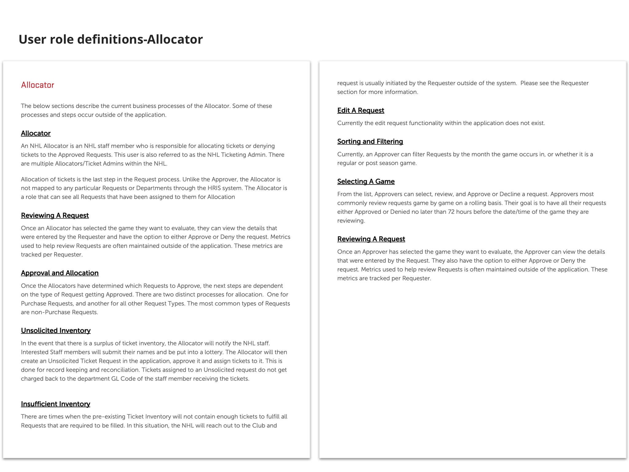
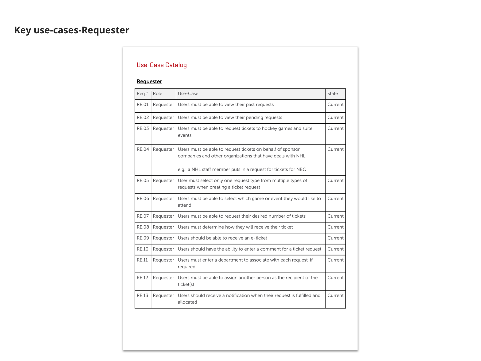
As we interviewed stakeholders and users of the old system, it was important to interview high volume users as well as low volume ones. While there are many more low volume users (all NHL staff) the high volume users are using the application as a part of their job function and not as an employee perk like the occasional users. After several interviews, it was clear that the NHL Stakeholders wanted us to prioritize the needs of users who would be the high volume users as they were using it for job functions. To ensure we were on the same page with the NHL we created “current state” documentation from these meetings documenting the process for each user as well as a use-case catalog. This would be the bare minimum needed for our application to replace the one currently being used. Ultimately our plan was tor replace and enhance the current application bringing more of their process into a single application.


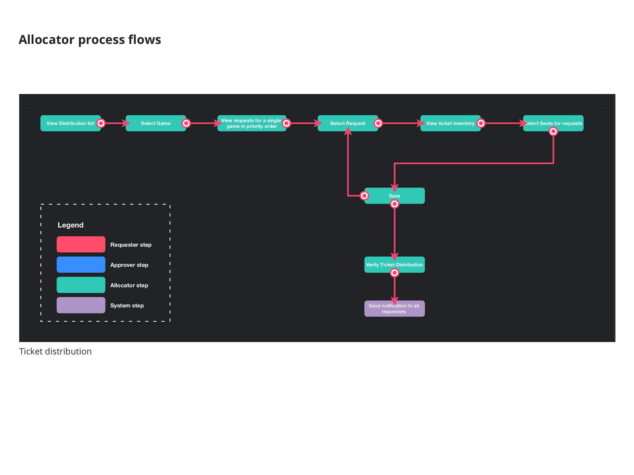
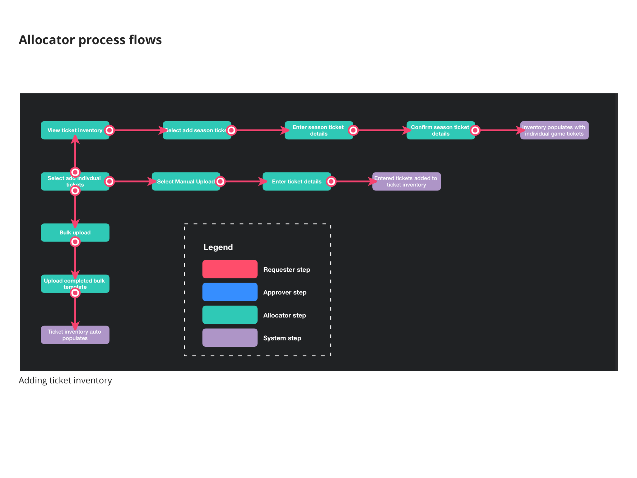
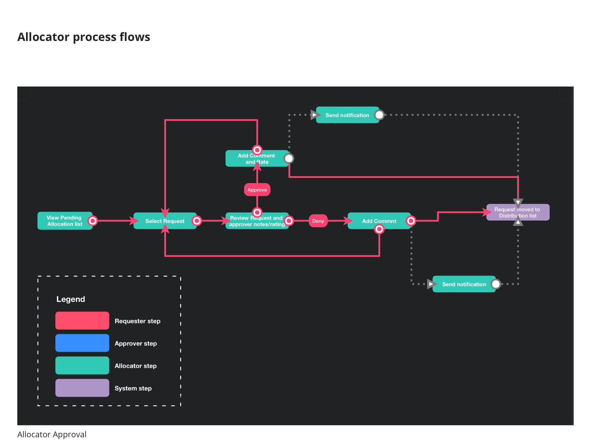
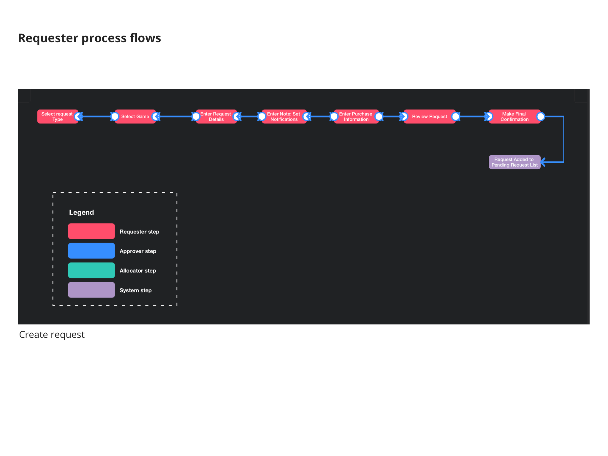
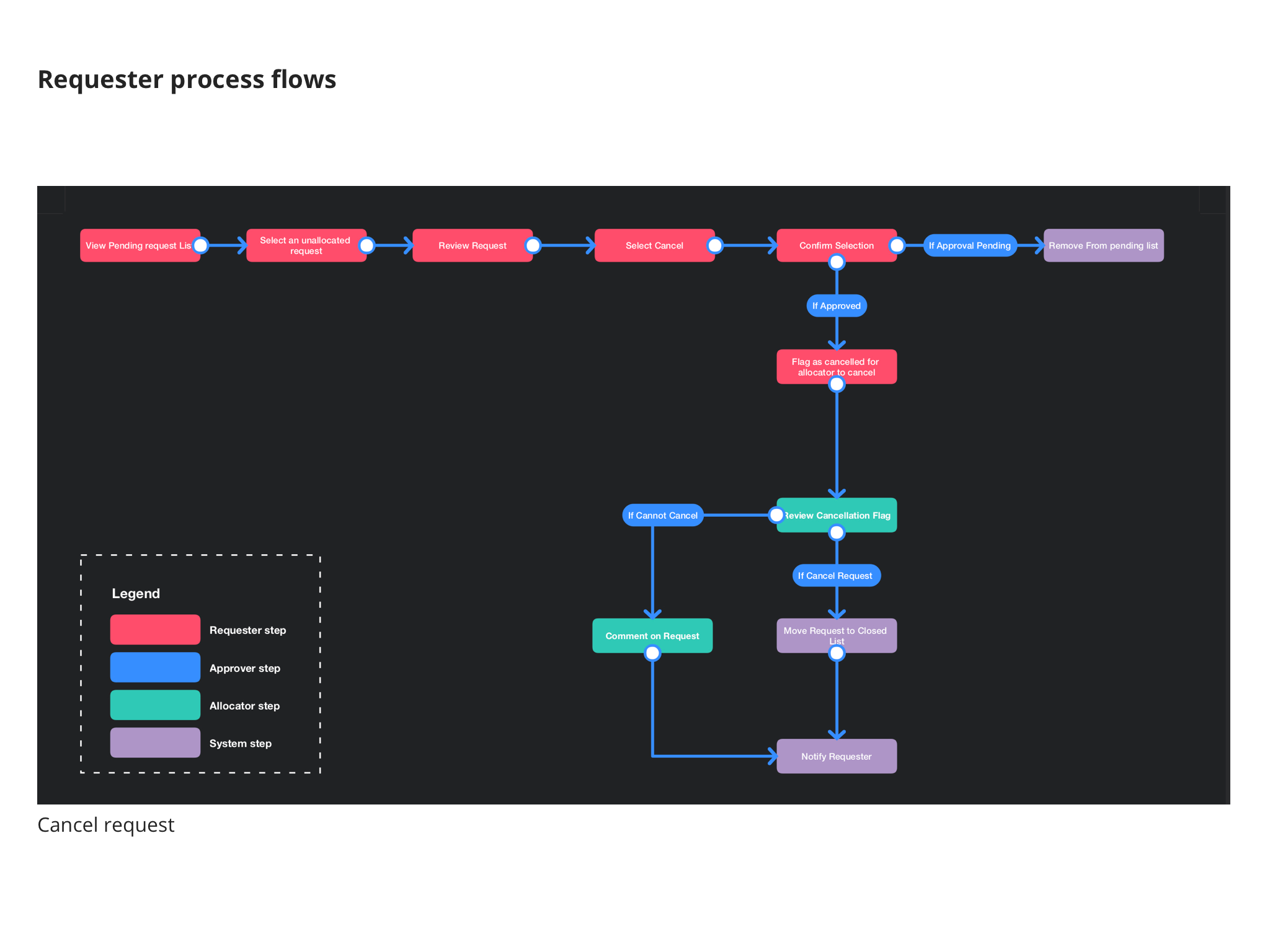
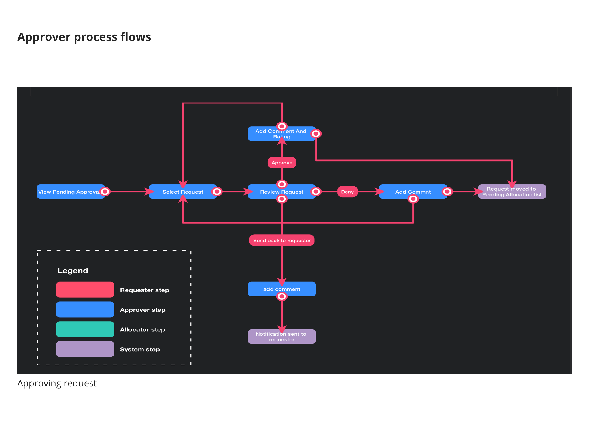
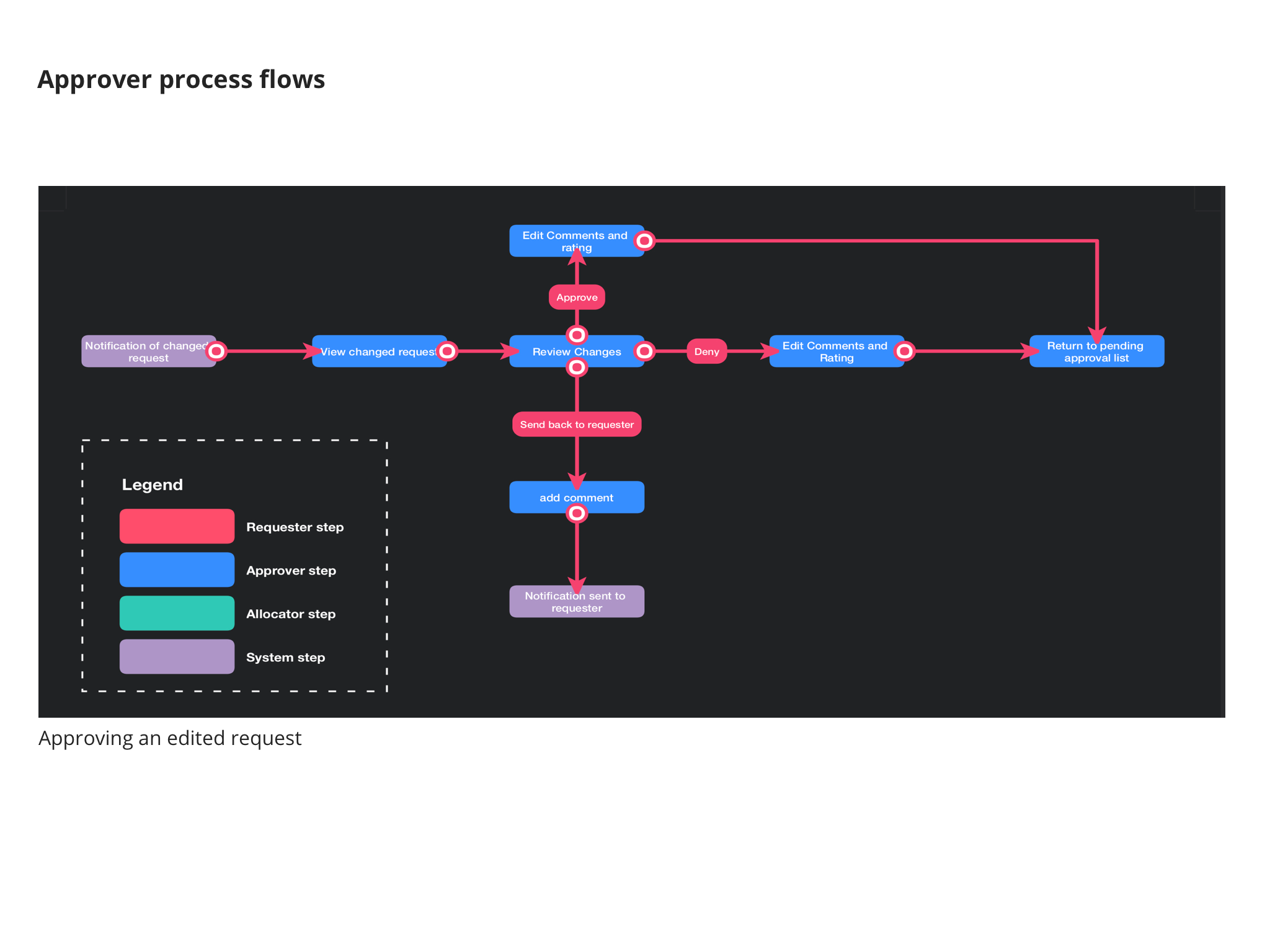
Updating the process flow
As we interviewed user types to understand how the old system works and how the new one should work. What I realized is that the individual process flows were not very complicated, but the real challenge came from creating a single interface that would allow each user to complete all of their needed activities and keep as much of it within the system. Currently, communication about the requests and edits to the request was generally happening over phone and email. Additionally, the power users which would need to request hundreds of tickets a year were forced to do much of their planning in spreadsheets

Early Design Concepts
As we neared the end of our interviews we began to have plenty of ideas for how we could update their application and process. There was an earlier attempt to come up with a design for this product from an earlier team. As we spoke to the stakeholders we learned the earlier concept would not work because it focused too much on the low volume users and sacrificed efficiency for the high volume users.
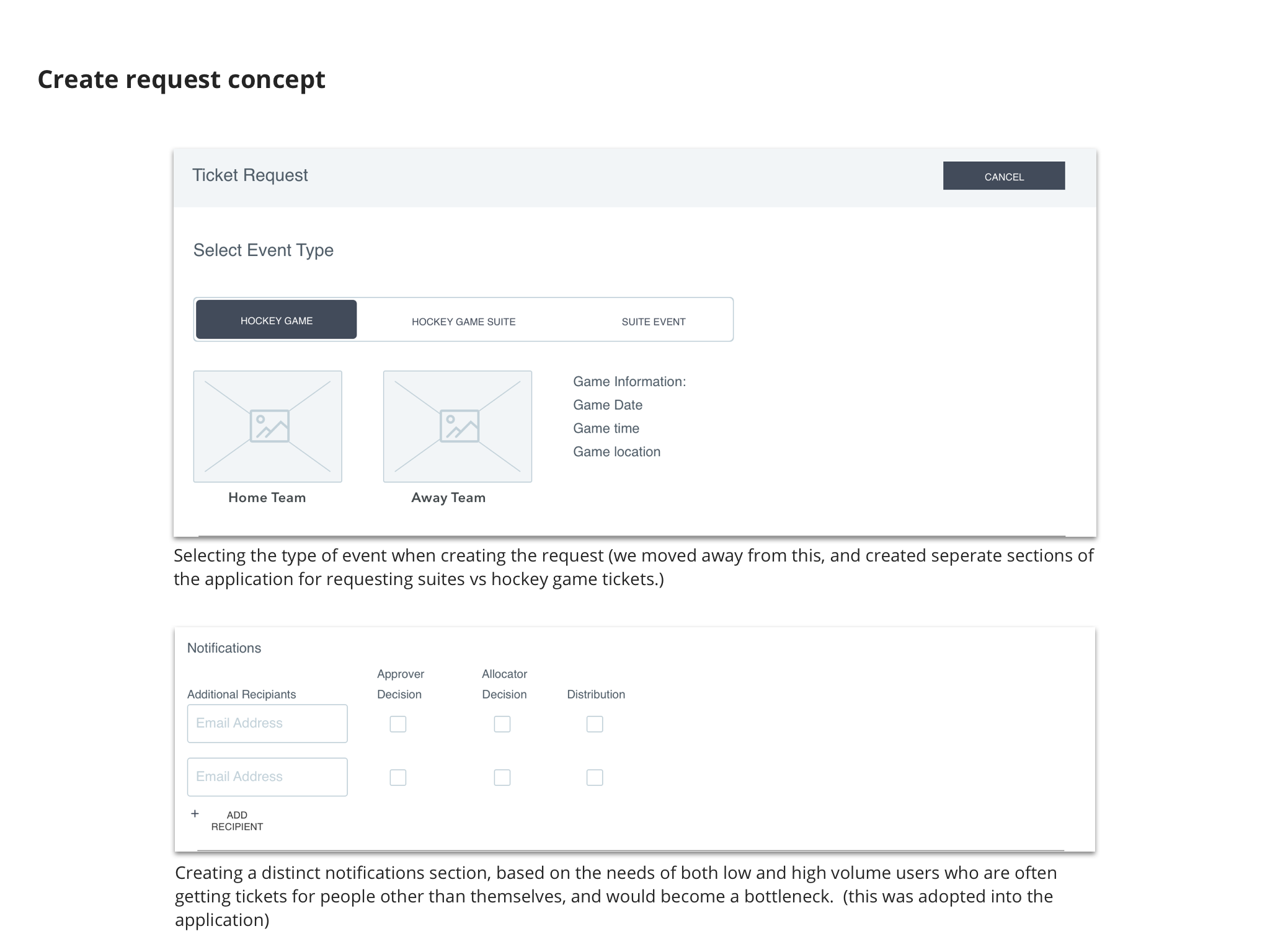
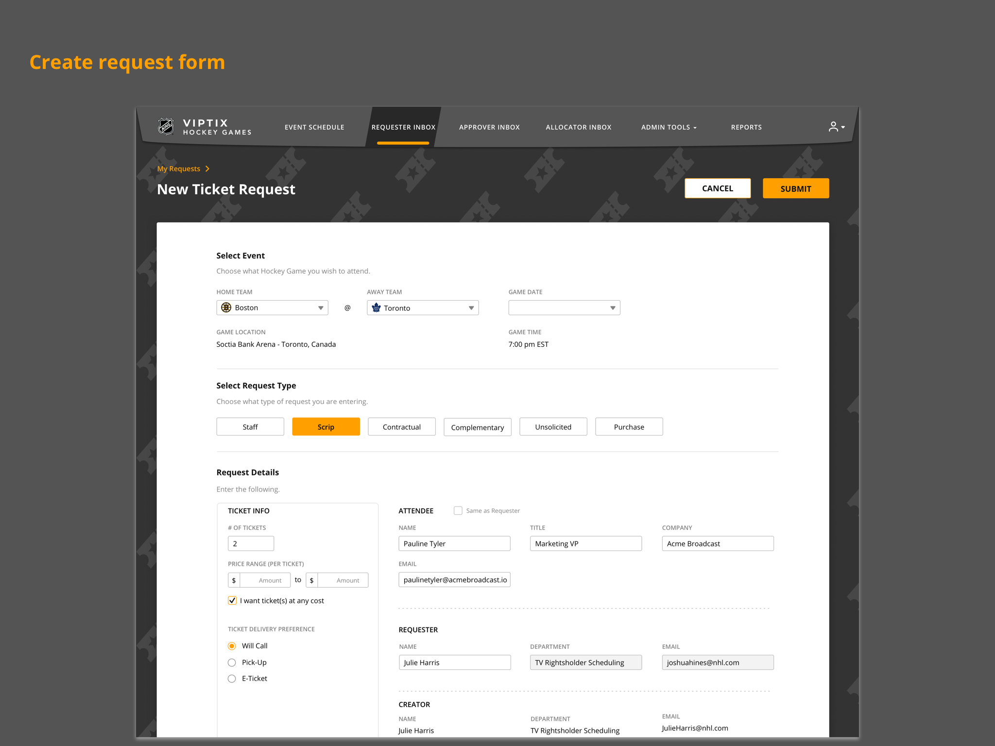
Wireframes
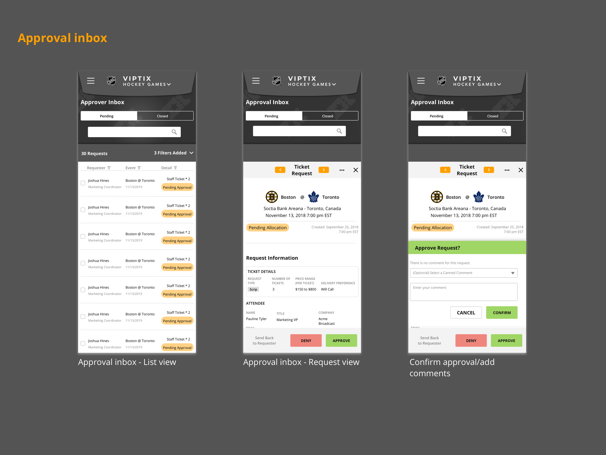
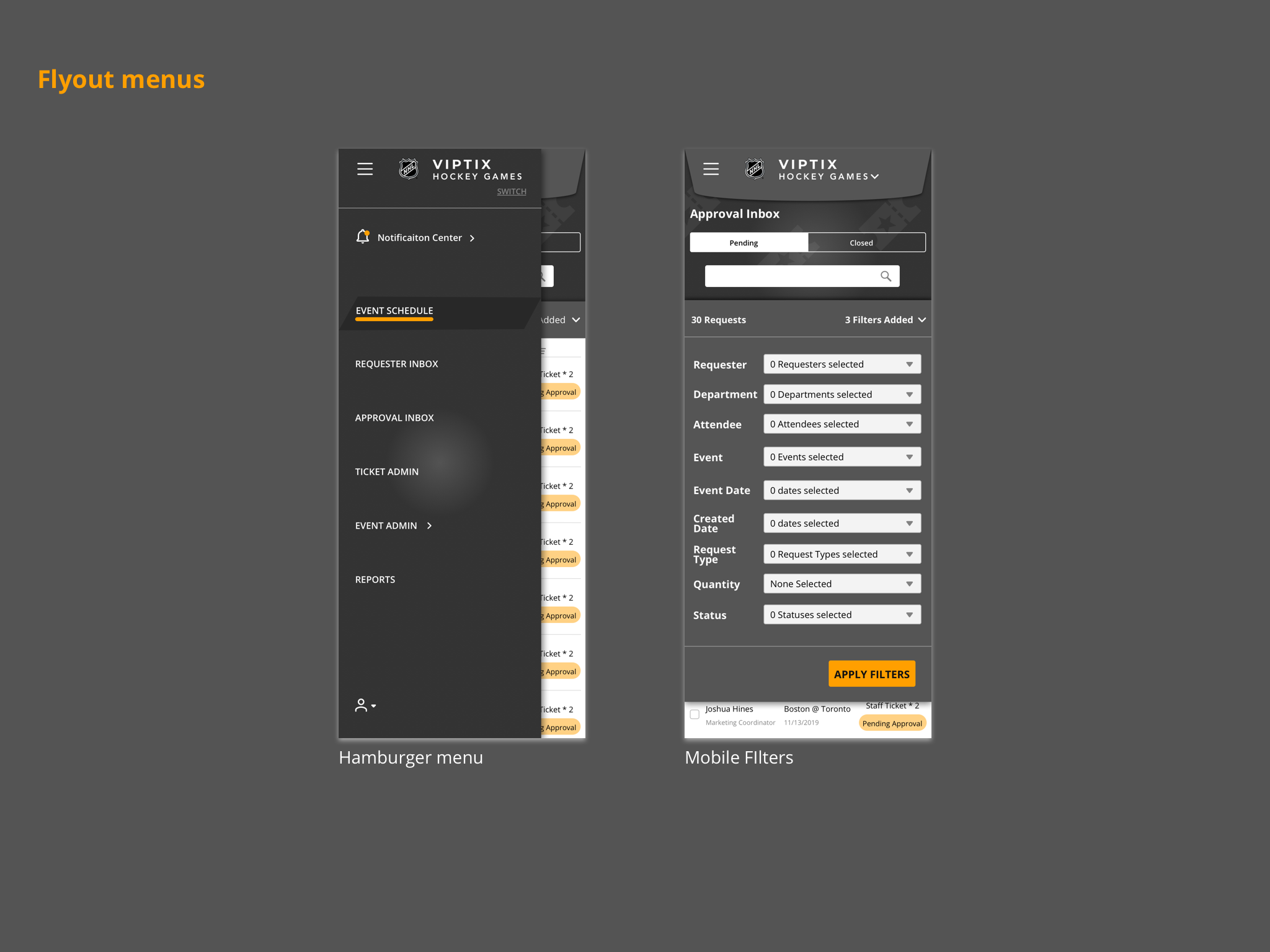
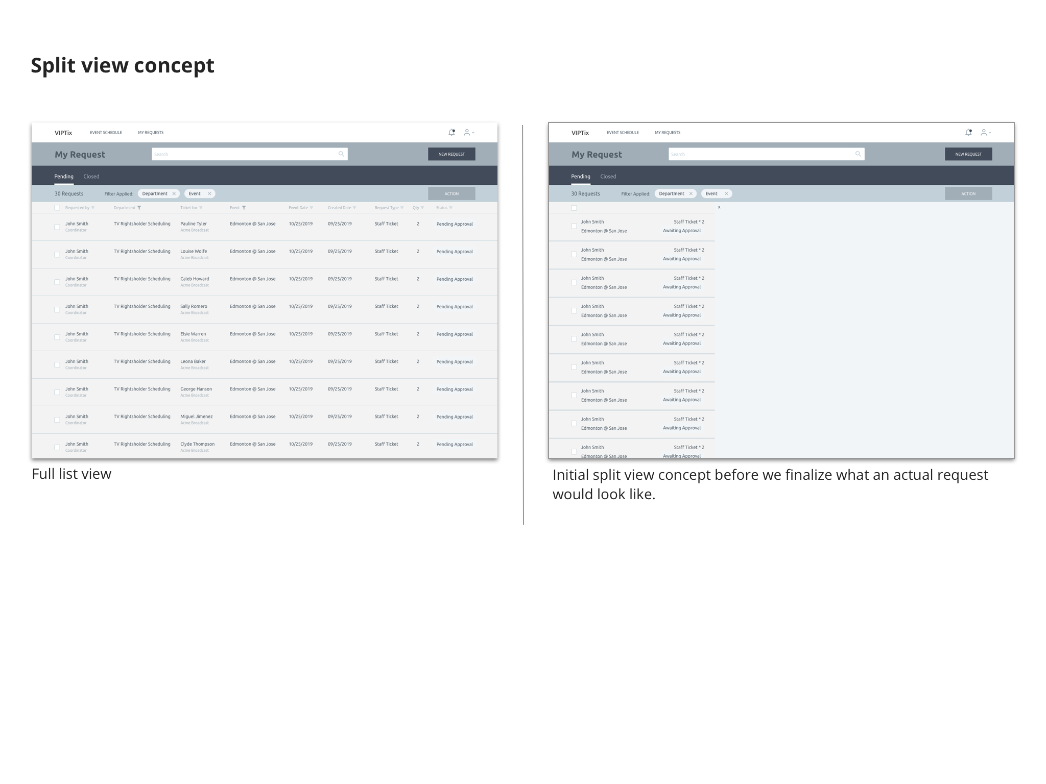
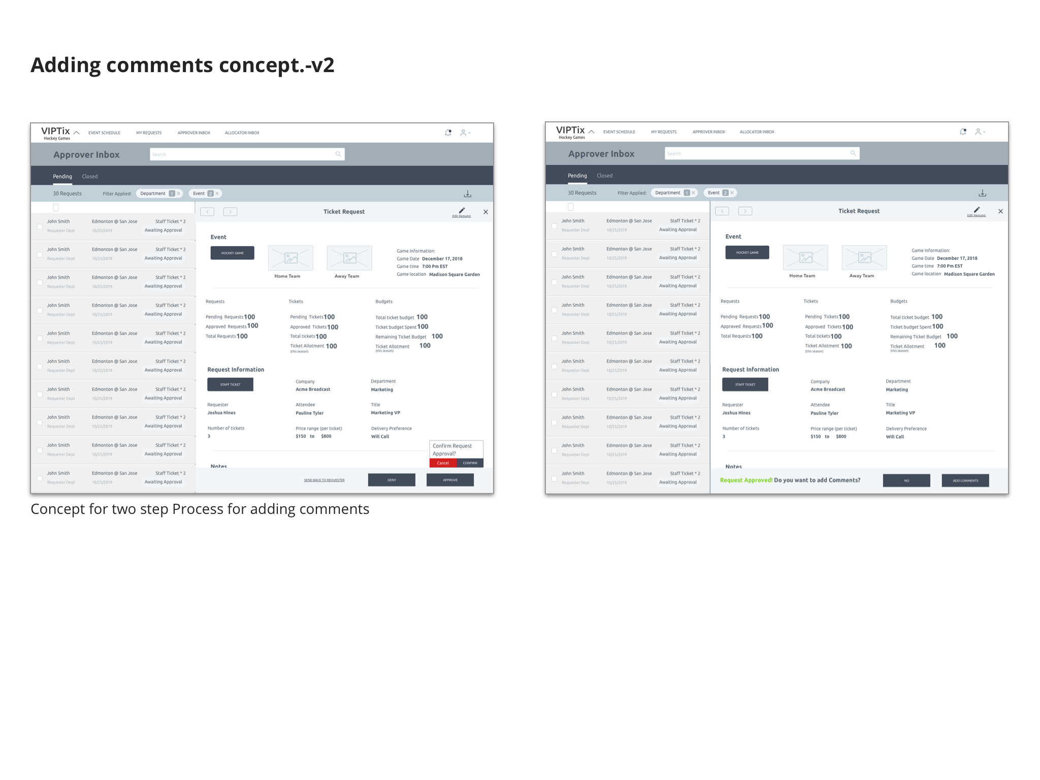
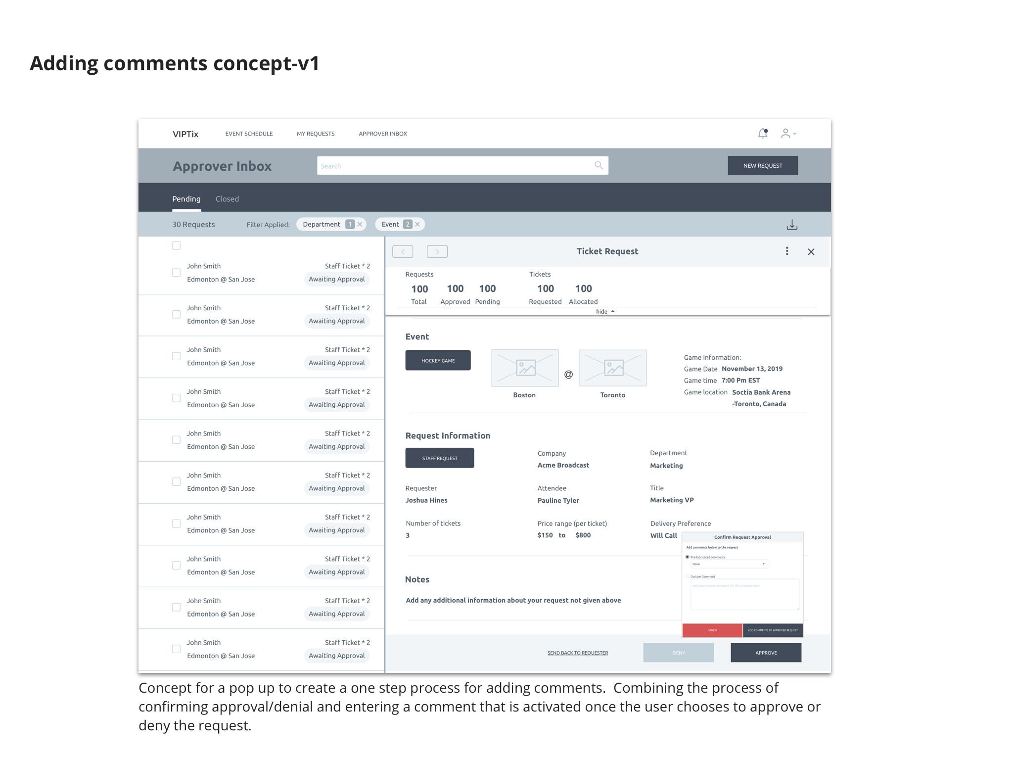
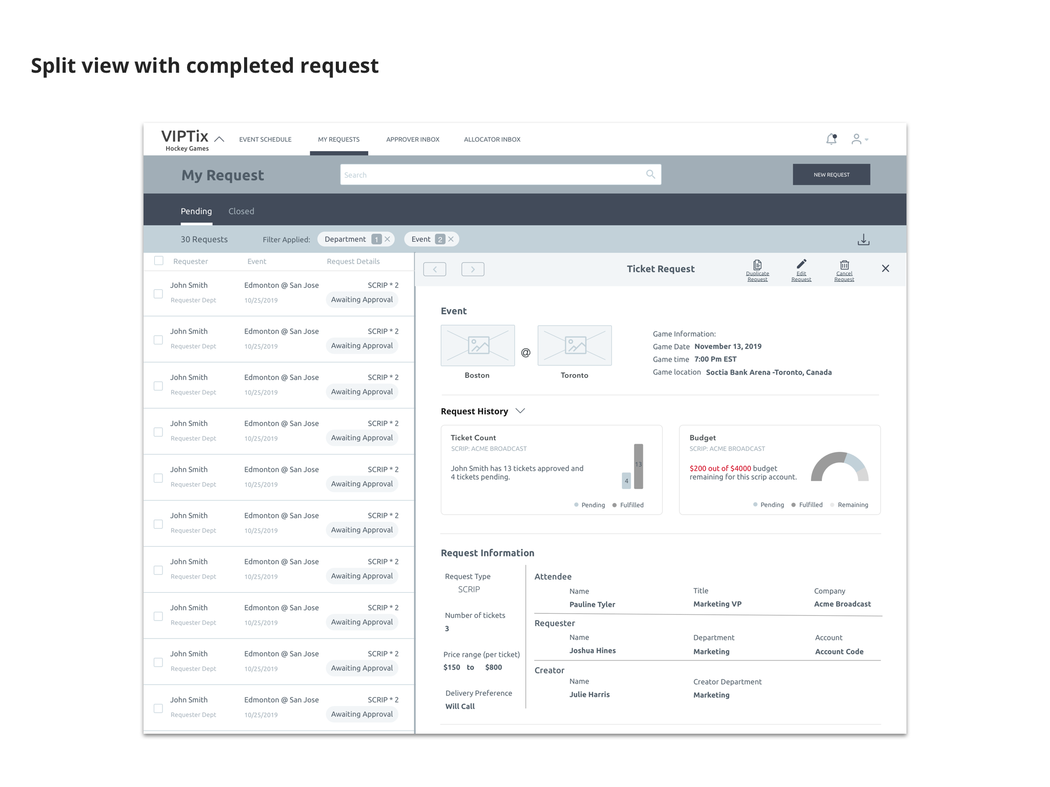
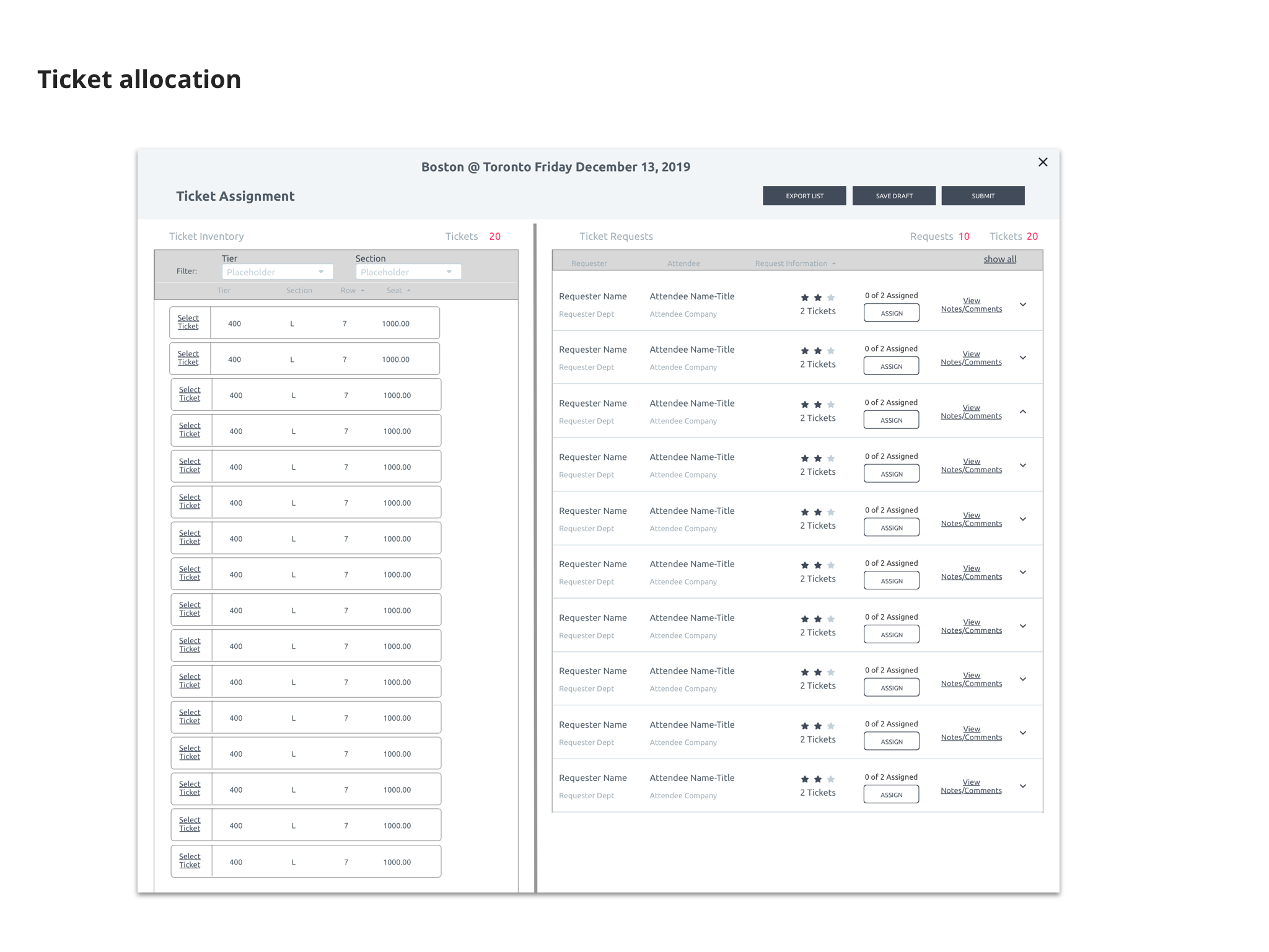
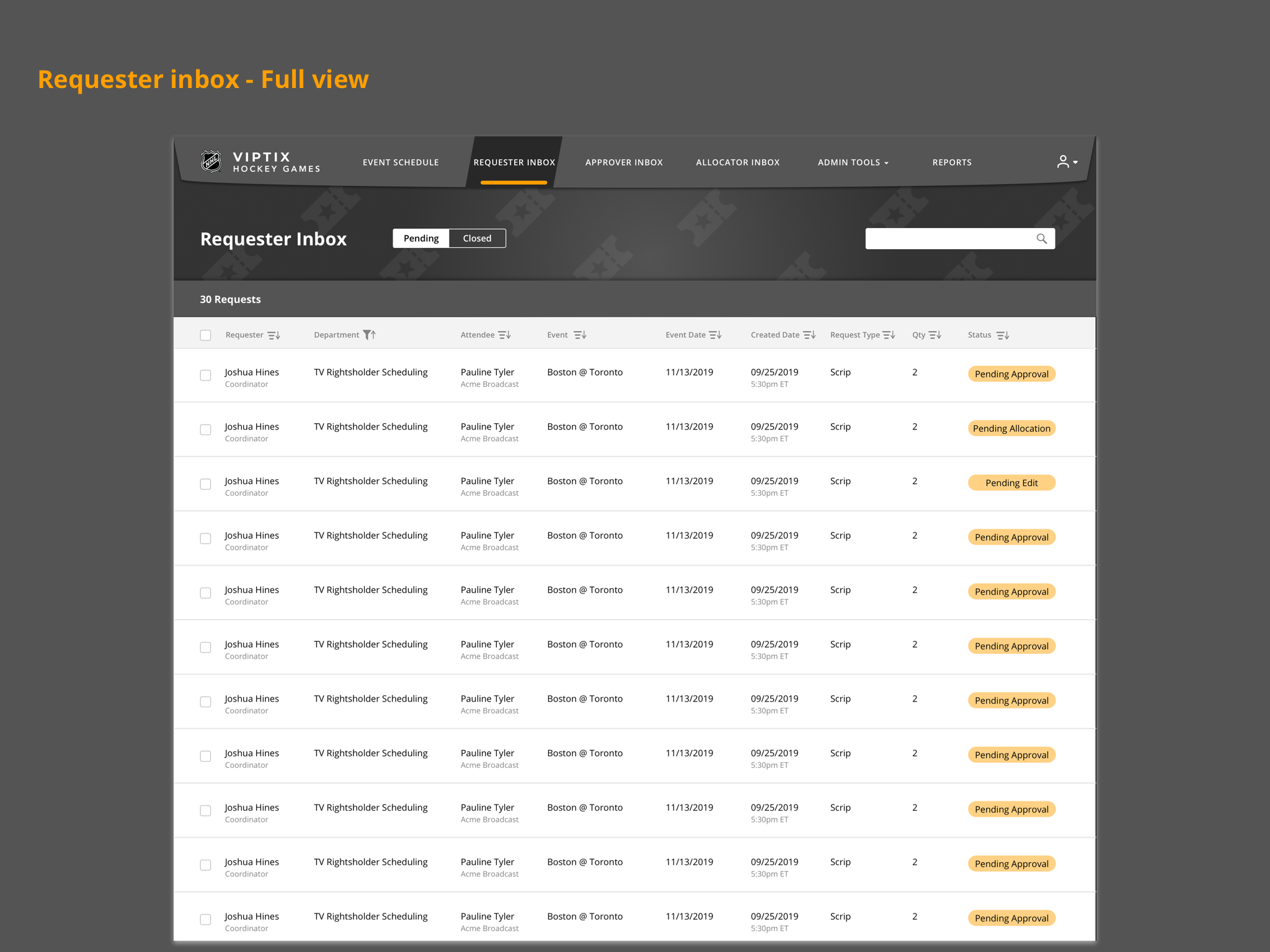
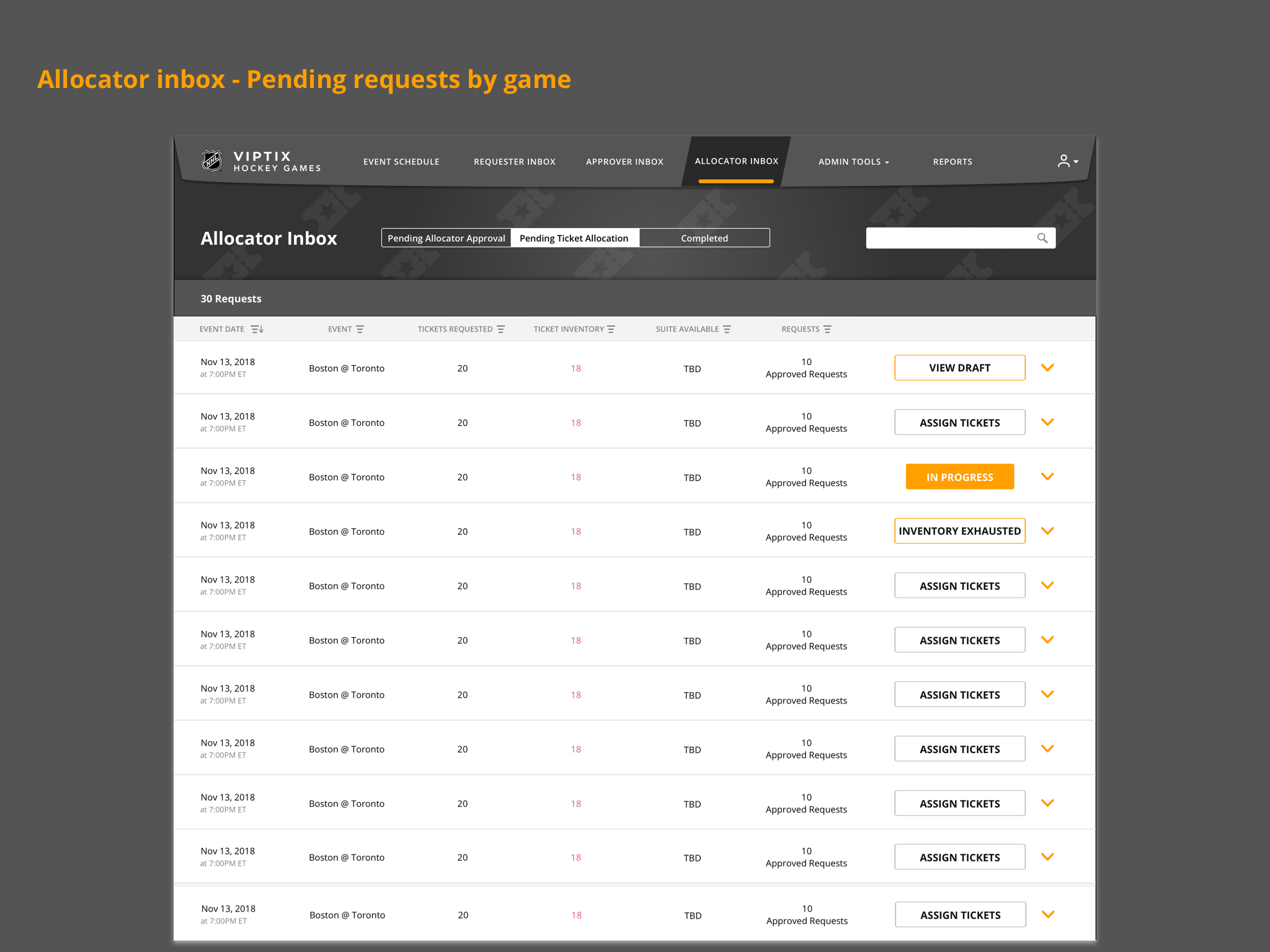
As I began working on the more formal wireframes and screens, one of the largest pain points from all users was the annoying process of going from the view of a single request to your list of requests required multiple clicks and a page load just moving around the application became frustrating. The other large pain point was the general usability of the application with small text and awkward layout and language on the forms. These usability issues were causing extra work for the allocator adding extra communication points to ensure the information was accurate.

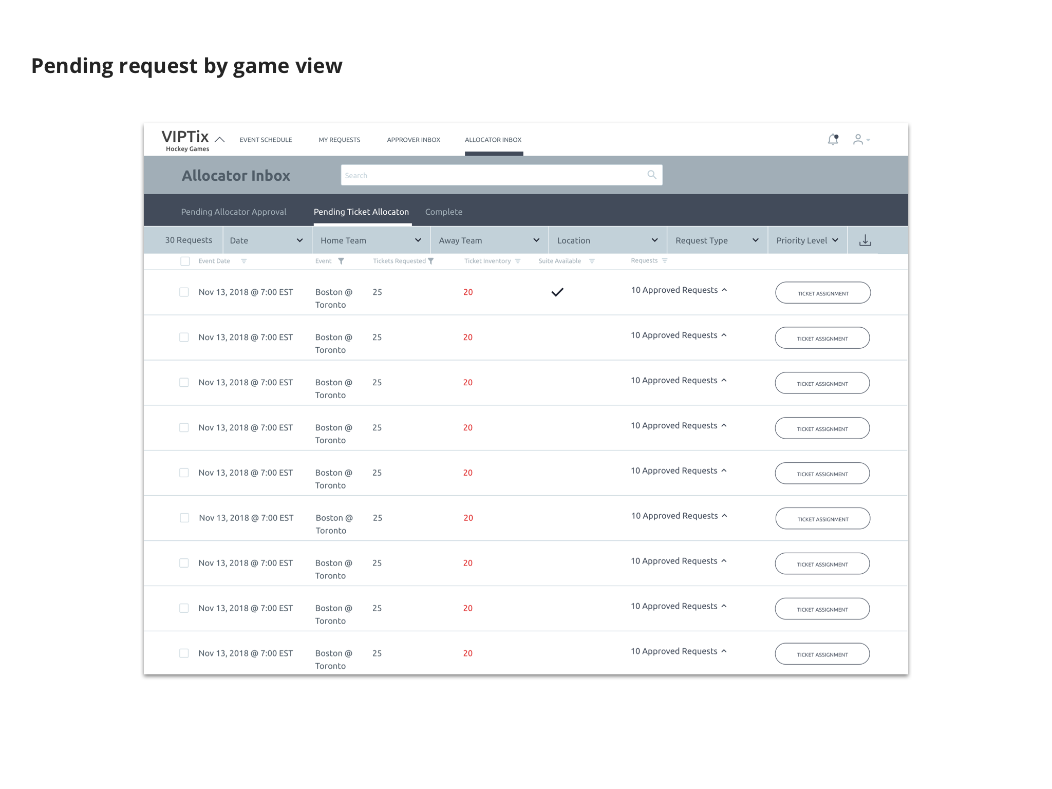
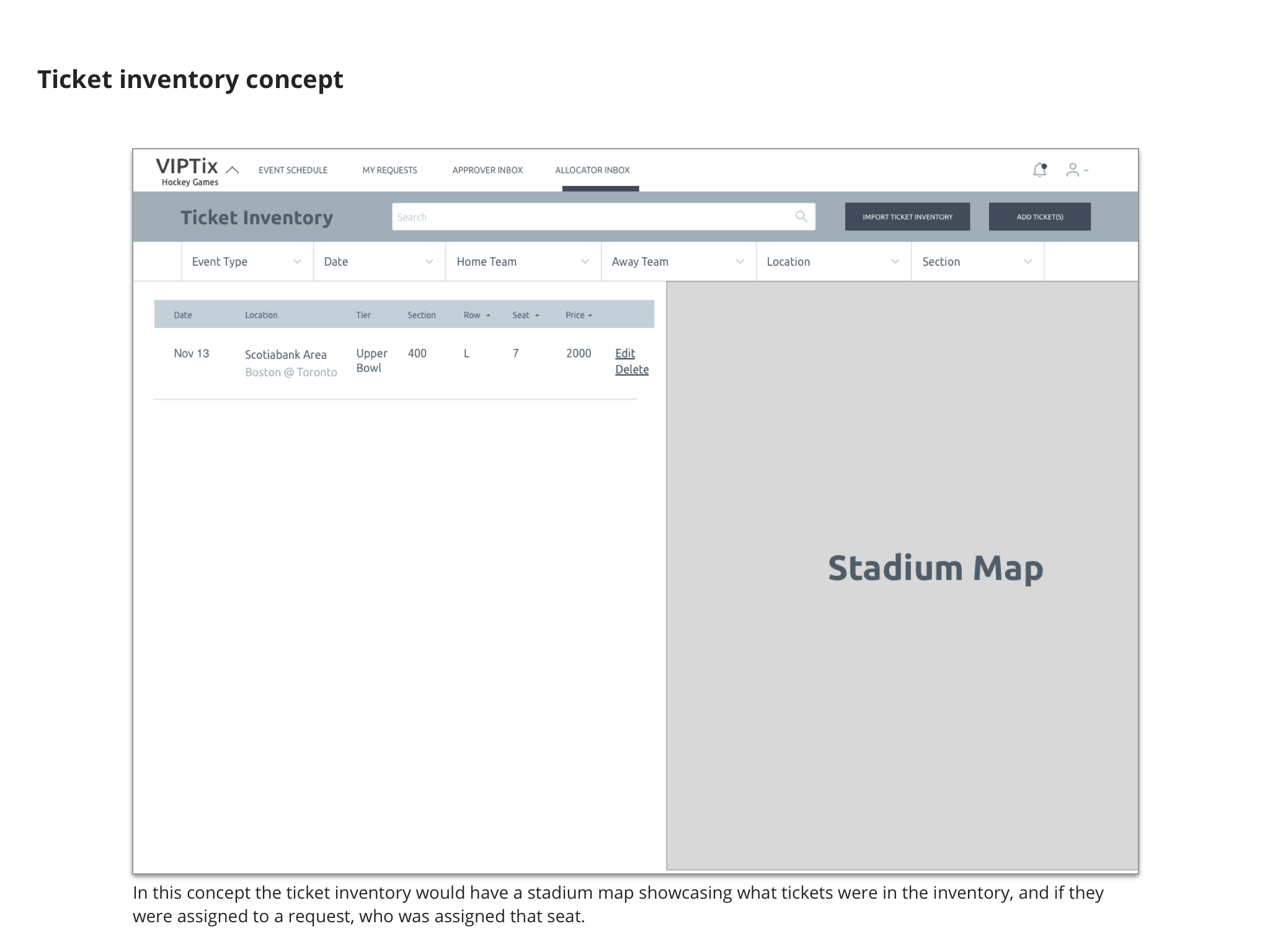
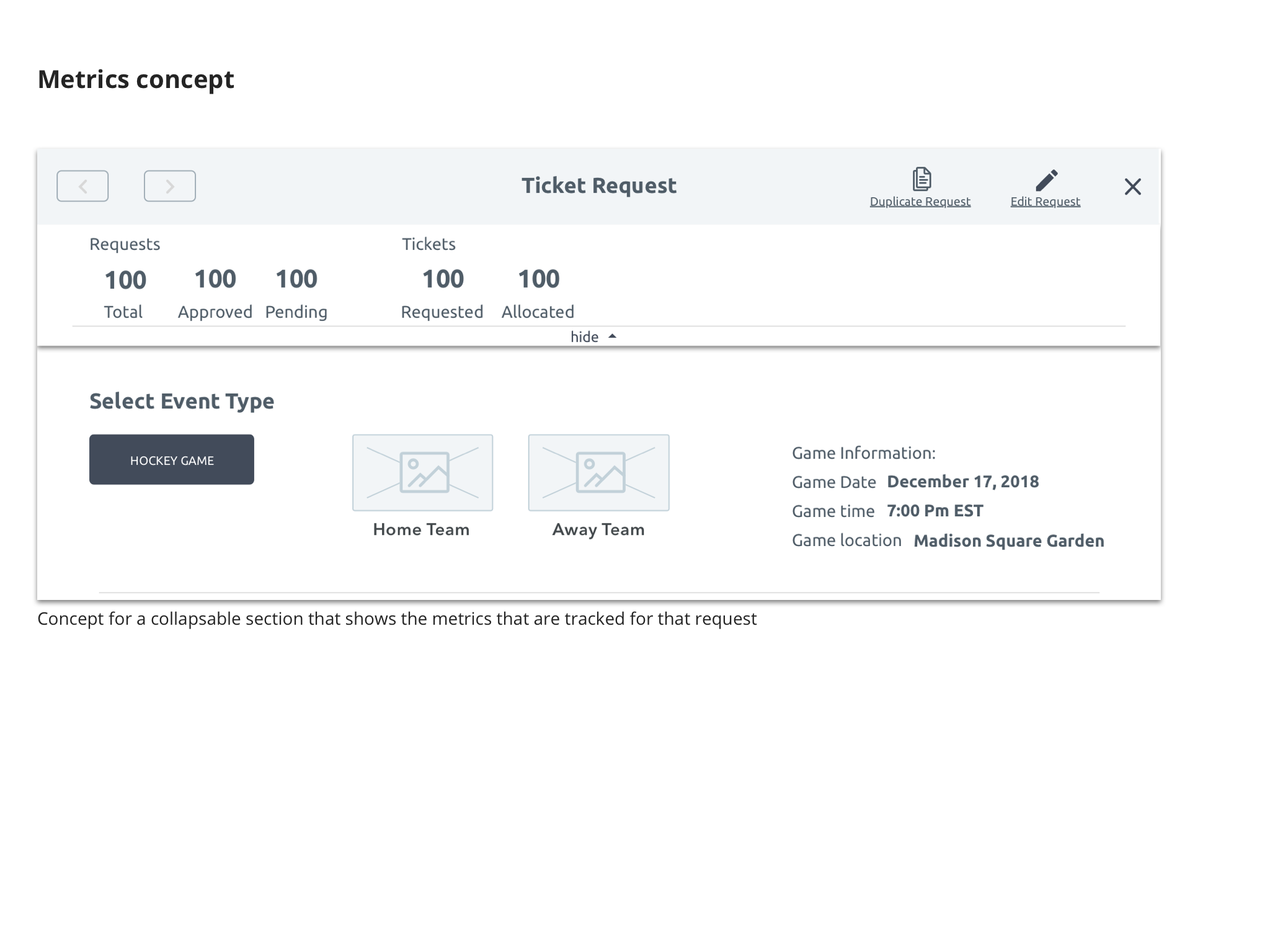
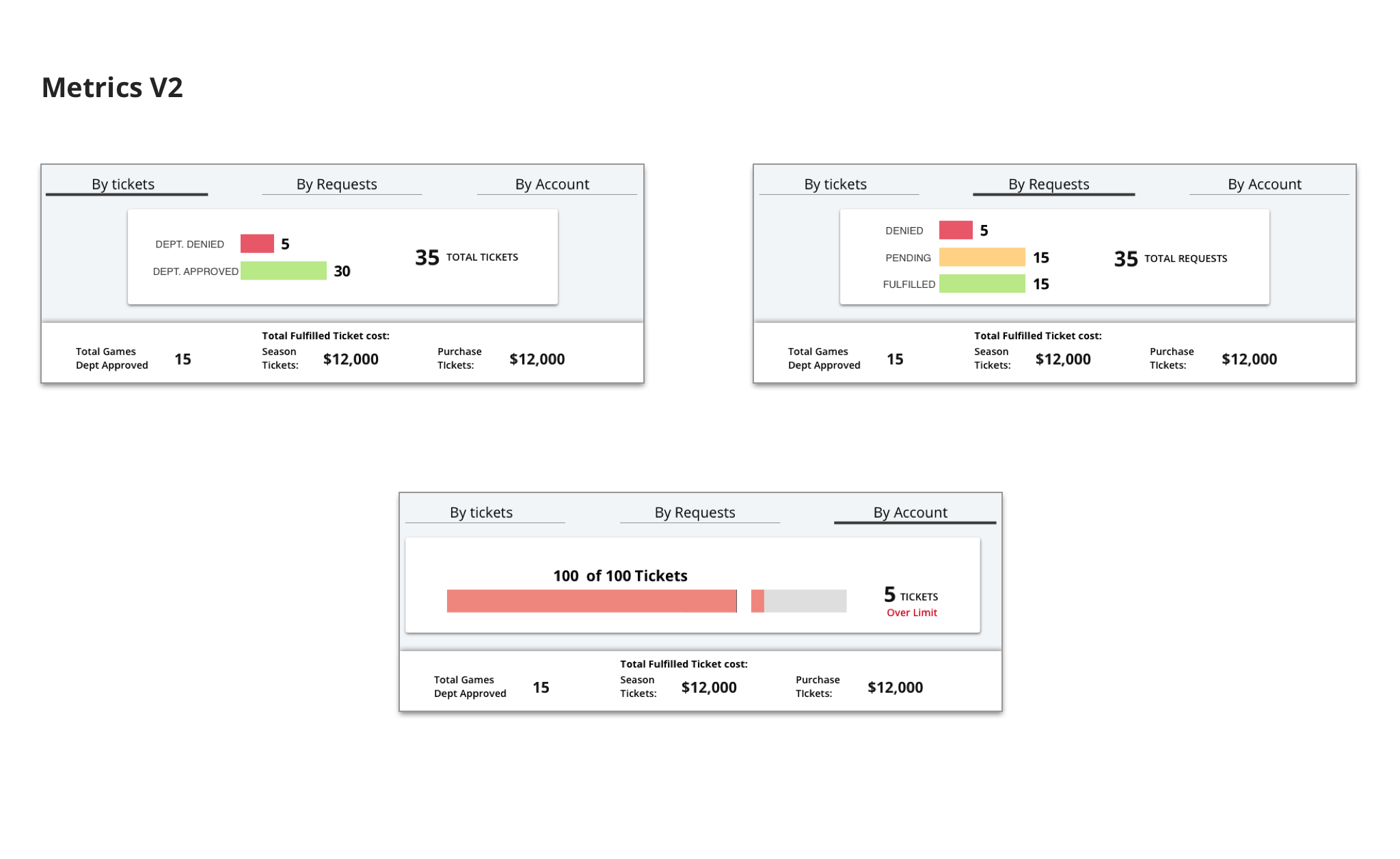
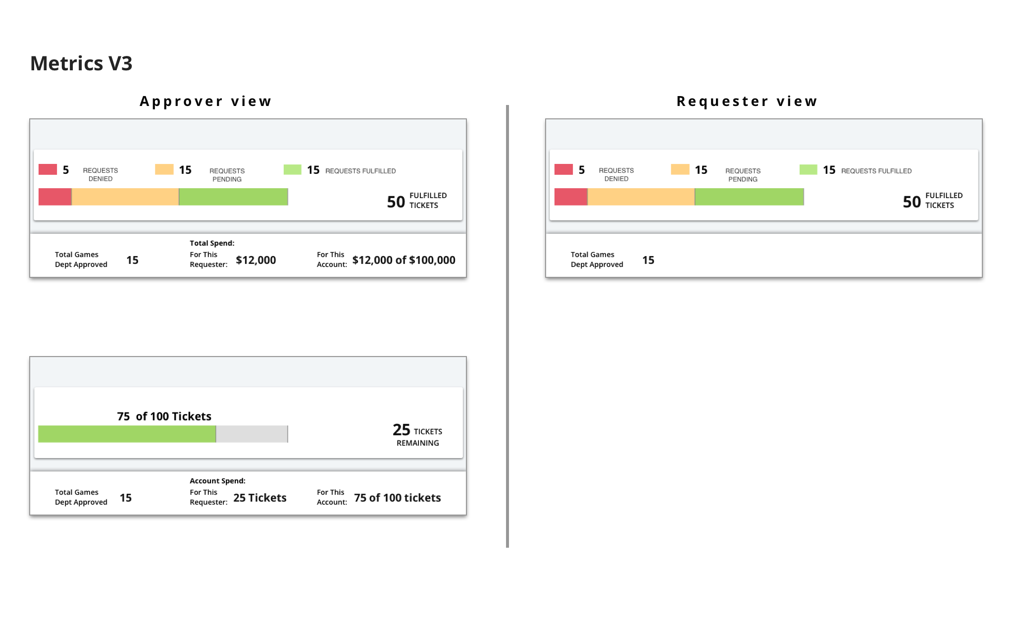
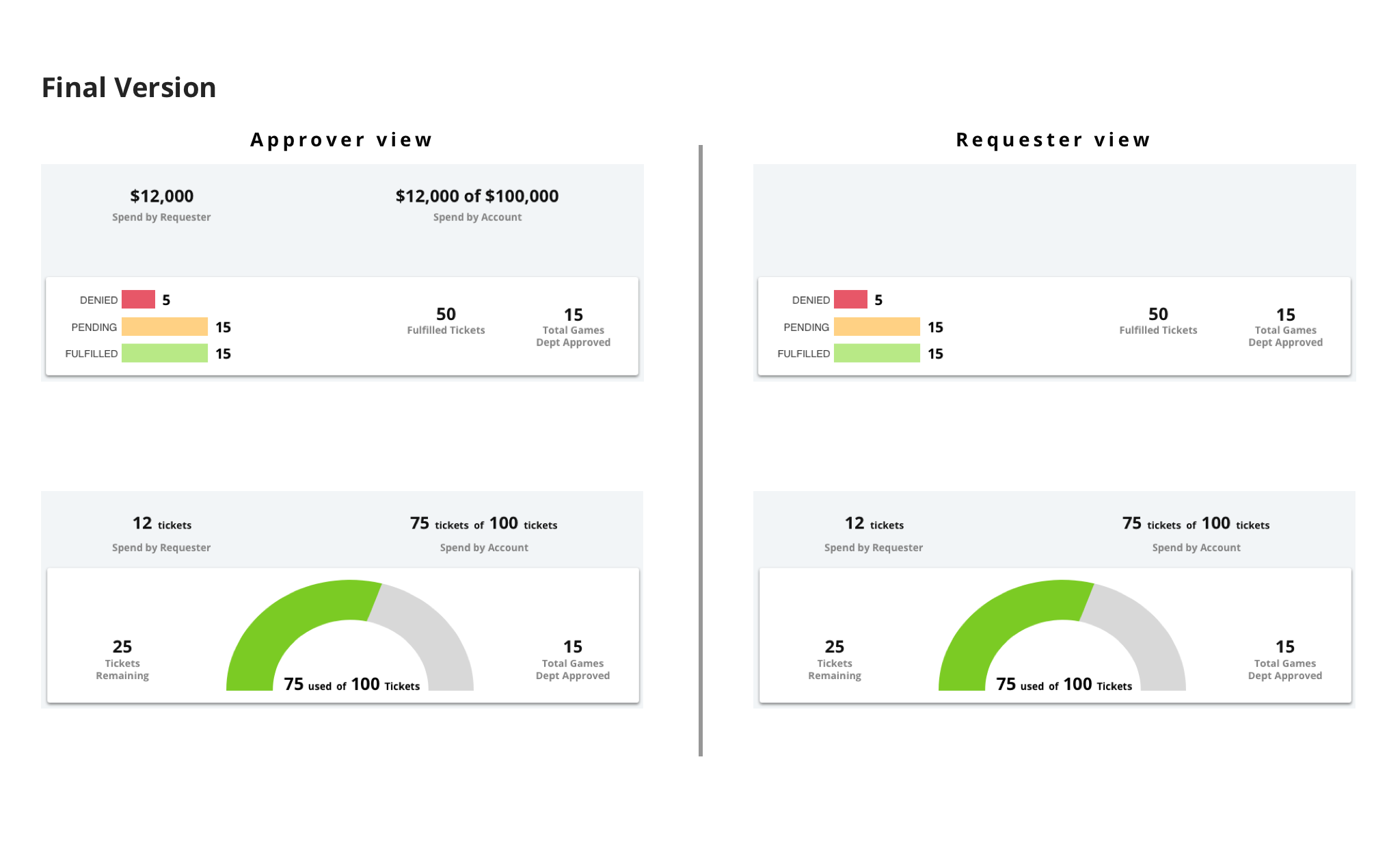
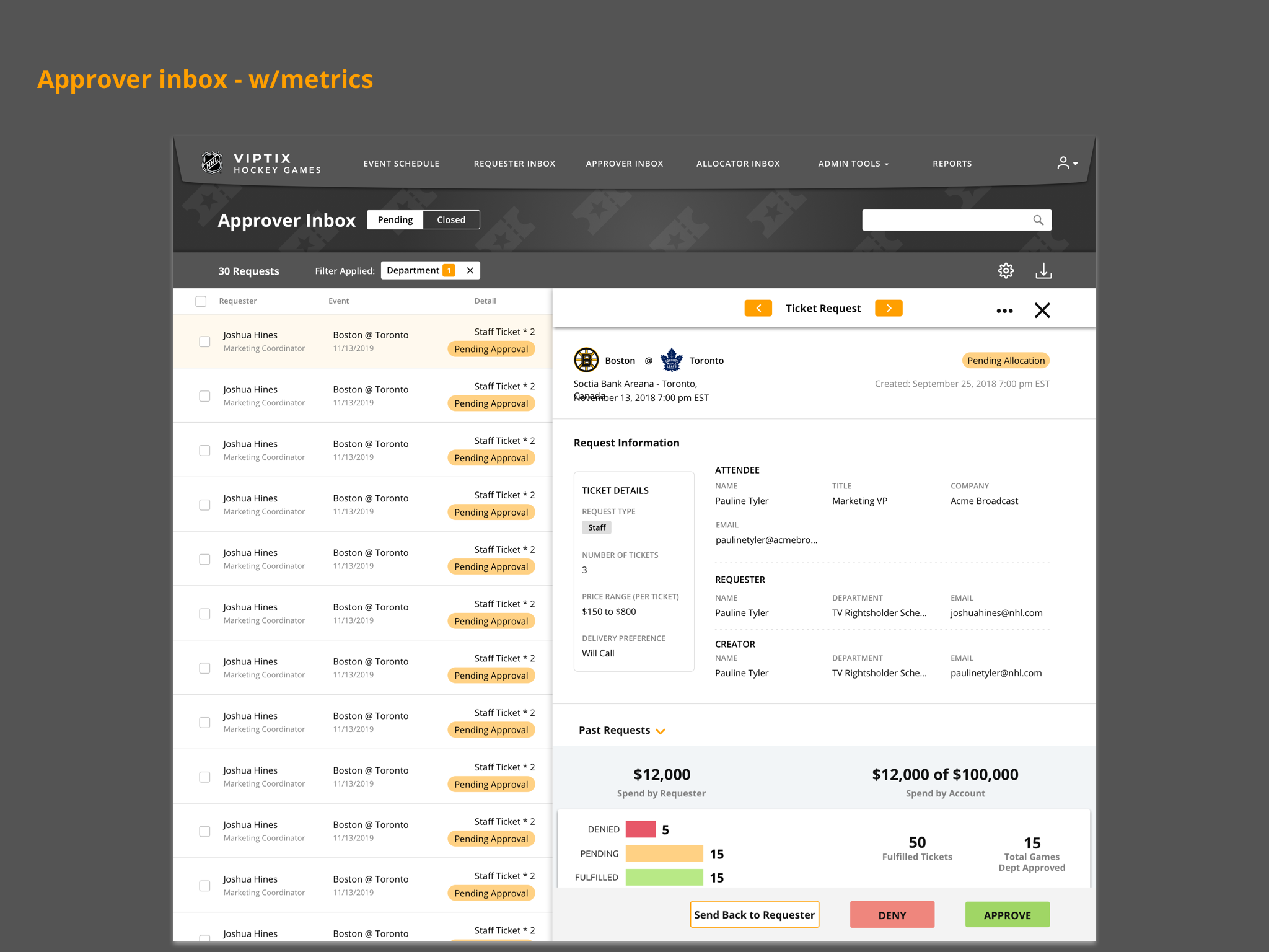
Data Visualizations
One of the key feature addition for the approvers was the ability to see metrics behind each request that comes across their inbox. This would be key to improving their process so they did not have to keep their own separate records. Once we determined what metrics were needed to track, we went through several iterations to determine what metrics were visible, to the various users, and for which requests


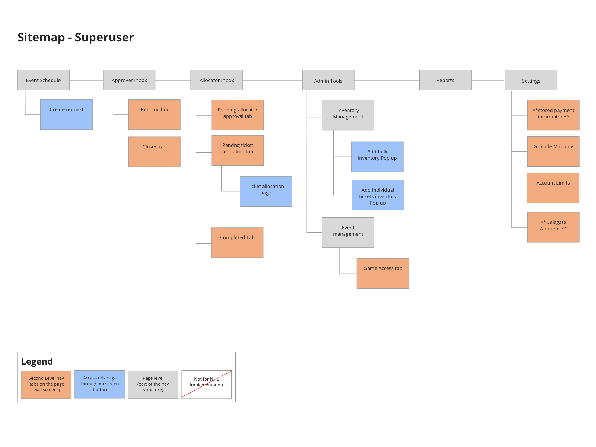
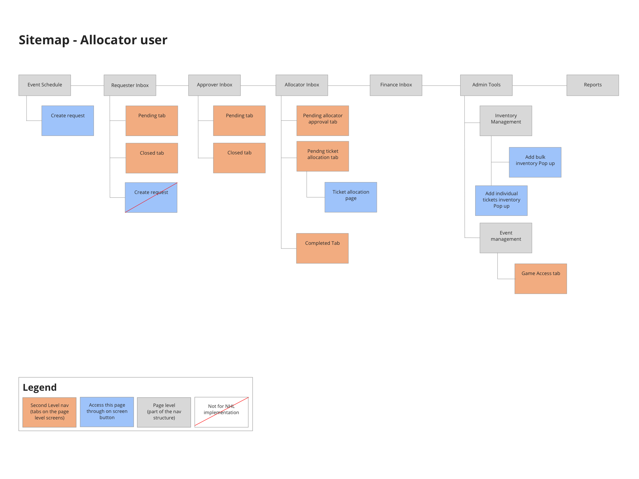
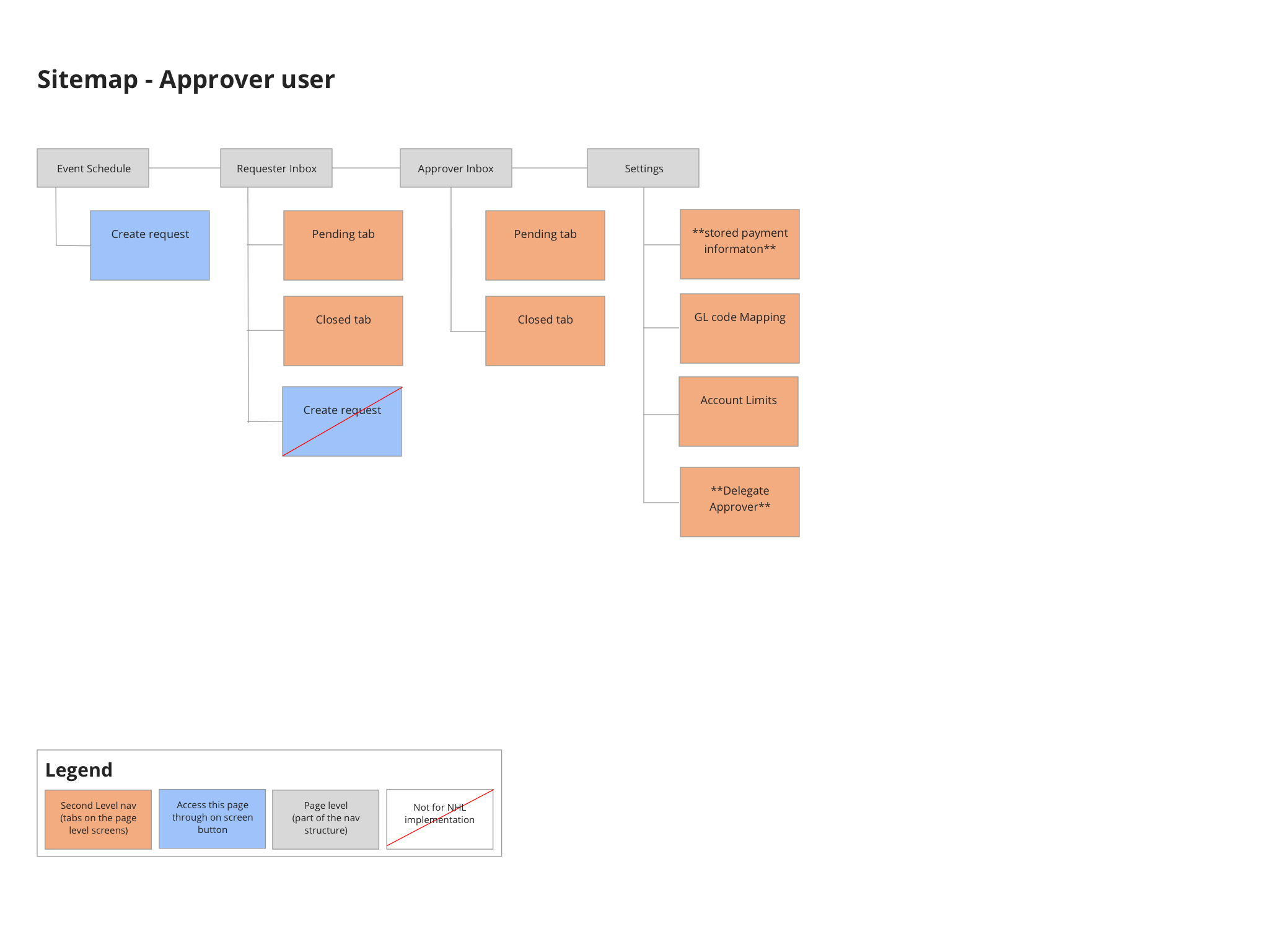
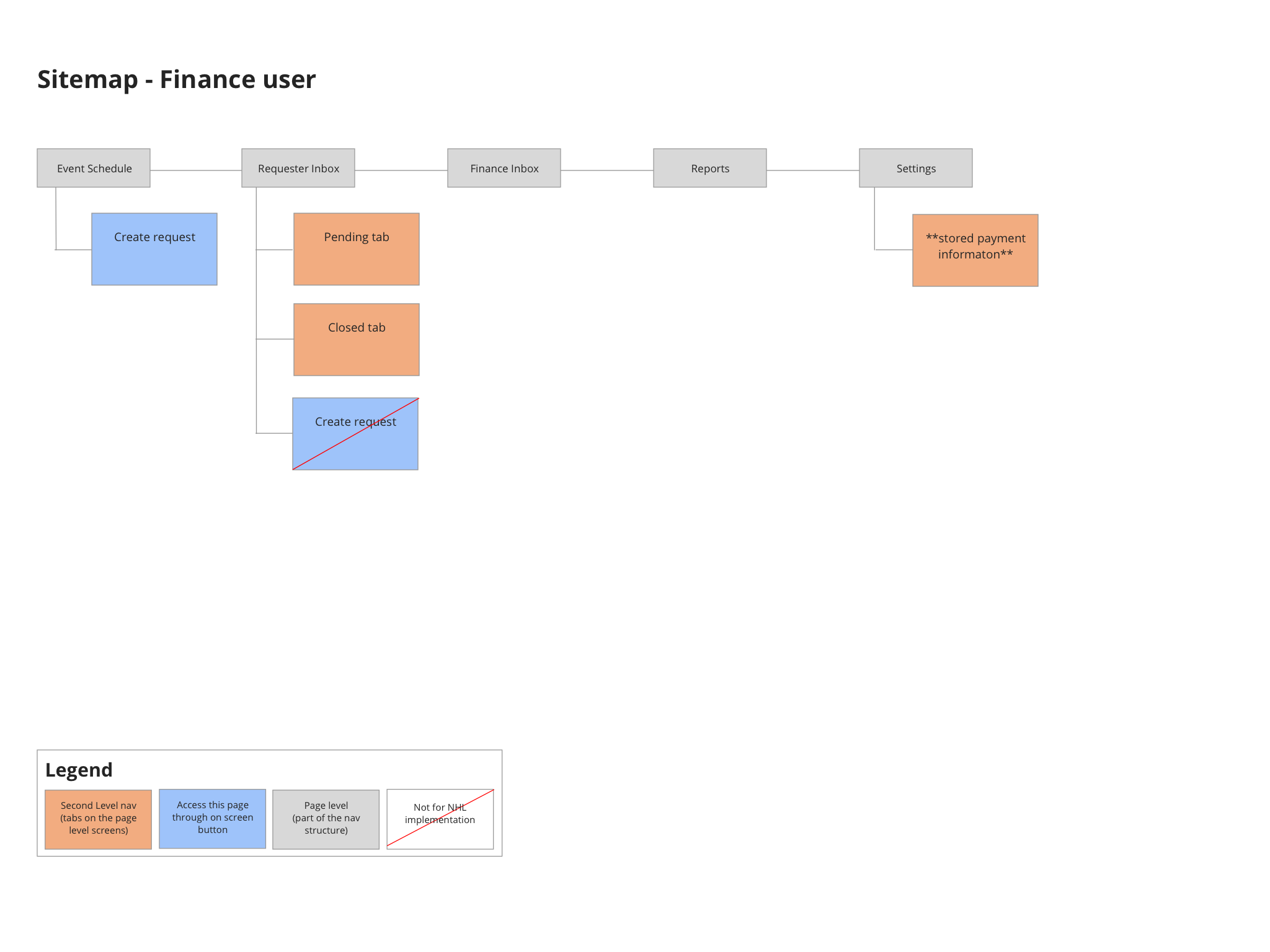
Sitemap by user type
Since each user type would have a different set of permissions and access to different parts of the application I created site maps for each of the user types in VIPtix. This was helpful in explaining to NHL stakeholders that users would only be able to see what they are supposed to. This was also a clear way to visualize the difference between the user types for the developers.

Finalized Designs
After creating and getting approval for all the key screens for each user, there were only a few outlier screens left to account for. Even though our UI designer had left the project at this point because we were left with a full style guide it was a lot easier to use the style guide to build out the final screens in the same style as the key screens. And with this strong base, it was easy to add additional elements to the UI and make sure they fit within the existing styles.


Mobile View
Creating a design that would lend easily to a mobile view was an important consideration from the beginning. However it was put low on the priority list as the application would be located within the NHL intranet, so it can only be accessed by NHL approved machines. This severely limited who would have access to the mobile site to only the Approvers (because the Approvers are the users with the highest positions within the company and are often given mobile phones from the NHL). Because we already had the concept of a split view it was an easier transition to mobile, we would just remove the ability to look at your list of requests and a single request at the same time.